Causal Inference in Practice With Observational Data = Machine Learning + Heterogeneity Metric (KS + X2 Tests) + Optimize Function + Metric Cache + H2O.ai

In the last post we described the theory necessary to perform causal inference in observational data, but we left unanswered some questions on how to estimate the propensity score function. We made this choice, because the details on the best way to estimated such function are not that simple and needed a exclusive post, so the explanation would be more consistent.


PS Model Should Not Predict The Treatment Variable As Well As Possible

There is a common misperception about how to estimate the PS model, when the analyst learning about causal inference already has some experience using machine learning algorithms to solve prediction problems. Hernán in his forthcoming book bring this problem to our attention:

“Unfortunately, statistics courses and textbooks have not always made a sharp difference between causal inference and prediction. […] Specifically, the application of predictive algorithms to causal inference models may result in inflated variances […]. One of the reasons for variance inflation is the widespread, but mistaken, belief that propensity models should predict treatment T as well as possible. Propensity models do not need to predict treatment very well. They just need to include the covariates that guarantee exchangeability.” – Chapter 15, Section 15.5 – Hernán MA, Robins JM (2016). Causal Inference. Boca Raton: Chapman & Hall/CRC, forthcoming.

This lights up a red flag for us as we intend to use machine learning algorithms to do this estimation. The purpose of the propensity score model is not to separate the best way possible both treatment classes, but to best estimate the treatment assignment probability of each observation. Such statement forces us to ask an important question: which error measurement best suits such purpose? Besides that, Hernán also says that including the correct covariates to estimate propensity score model is enough to avoid misspecification. Well, if we limit our statistical algorithms to GLM with no regularization, such statement is valid, once it does not require search for the best hyperparameters. However, again, we intend to use machine learning algorithms to perform such task. So, first we need to establish a novel criteria, different from logloss and AUC error metrics, to measure the performance of models for this specific purpose, before we can start doing some programming.


Measuring Treatment Assignment Probability Error: Heterogeneity Metric

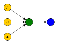
Now, we need to understand what implies finding the best estimate for the treatment assignment probability of each observation. Suppose we specify the statistical model perfectly and we use the yielded probabilities to apply the process to create a blockage between T and its parents covariates. In this way, we would establish the exchangeability condition between treatment and control group. Which means that the distribution of all covariates parents of T are equal or pretty close, i.e. homogeneous, between treatment and control group. Therefore, to solve our problem we need to define a procedure to measure the heterogeneity between both groups for the covariates in sets 1 and 2 and use it to find the estimated model that minimizes the measured heterogeneity.

Our heterogeneity metric was inspired in the ideas behind the R package called twang and it is based on two homogeneity tests: Kolmogorov-Smirnov (KS) and Chi-squared (X2). The latter for categorical variables and the former for continuous ones. The Heterogeneity Metric is calculated by applying the correct homogeneity test to compare the distribution of a covariate between the treatment and the control groups. These covariates are the ones in sets 1 e 2, described in the previous post. Each homogeneity test varies from 0 to 1, where 0 represents minimum and 1 maximum heterogeneity. Next, we sum each covariate’s result and obtain the Heterogeneity Metric. Summing up, Heterogeneity Metric = Σ (KS or X2) for each covariate parent of treatment variable.

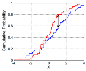
To give a better understanding about the homogeneity tests, we’ll show an short example of both. To understand how the Kolmogorov-Smirnov (KS) homogeneity test is calculated, we just need to take a look in the next figure. We sort the observation by the value of the covariate X and draw in a chart its cumulative distribution for the treatment (blue) and the control (red) group. To make them comparable, we need to normalize the sum of weights to 1 inside each specific group. The KS value is the biggest vertical distance between the two curves. Here indicated by the two headed arrow. As you can notice, its value is always inside the interval [0, 1]. As a sort operation is required and the datasets can be really big, we used the R package, data.table, to order the observations, once it uses a very fast and very memory efficient implementation of the radix sort algorithm.

image01

The other test is Chi-squared (X2) test of homogeneity that is applied to a single categorical variable from two different populations (control and treatment) to determine whether frequency counts are distributed identically across these different populations. Let’s use a simple example to show how it is calculated: in a study of the television viewing habits of children, a developmental psychologist selects a random sample of 300 first graders – 100 boys and 200 girls. Each child is asked which of the following TV programs they like best: The Lone Ranger, Sesame Street, or The Simpsons.

Observed Viewing Preferences Row total

Lone Ranger

Sesame Street The Simpsons
Boys 50 30 20 100
Girls 50 80 70 200
Column total 100 110 90 300


How homogeneous is the boys’ preferences for these TV programs when compared to the girls’ ones? To obtain the heterogeneity measure, first we need to normalize the counts, so the final result will be inside interval [0,1].

Observed and Normalized Viewing Preferences Row total

Lone Ranger

Sesame Street The Simpsons
Boys 0.1667 0.1000 0.0667 0.3333
Girls 0.1667 0.2667 0.2333 0.6667
Column total 0.3333 0.3667 0.3000 1.000


Second, we calculate the expected count for each cell: Er,c = (nr * nc) / n where Er,c is the expected frequency count for population r at level c of the categorical variable, nr is the total number of observations from population r, nc is the total number of observations at treatment level c, and n is the total sample size.

Expected Viewing Preferences
Lone Ranger Sesame Street The Simpsons
Boys 0.1111 0.1222 0.1000
Girls 0.2222 0.2444 0.2000


Third, we calculate the chi-squared for each cell: X2 = Σ [ (Or,c – Er,c)^2 / Er,c ] where Or,c is the normalized observed frequency count in population r for level c of the categorical variable, and Er,c is the expected frequency count in population r for level c of the categorical variable.

Partial X2 Viewing Preferences
Lone Ranger Sesame Street The Simpsons
Boys 0.0278 0.0040 0.0111
Girls 0.0139 0.0020 0.0056


And finally, we sum the chi-squared of all cells to find the total chi-squared: Total X2 = 0.0278 + 0.0139 + 0.0040 + 0.0020 + 0.0111 + 0.0056 = 0.0644. Which indicates that both preferences are relatively homogeneous and not that different. As a note, we implemented such algorithm using the R package data.table for a fast and memory efficient aggregation on big datasets.

You should have in mind, that we don’t want and don’t need to calculate the p-value for neither the homogeneity tests. We just obtain the statistics of the test for each covariate and add all of them to find the heterogeneity metric for the current weights.

Optimizing without using derivatives

Now that we have defined the metric, we need to establish how we’ll gonna use it with a machine learning engine. We know for sure that such metric is not defined in the engine itself, once such engines are normally used to maximize the prediction of labels, in the classification case, requiring very different error metrics. Therefore, we can only implement our algorithm using the engine to generate a model without performance evaluation and, externally to the engine, we calculate the respective error using a validation dataset. As you can imagine this can be very inefficient, once to find the best model we would need to test a huge amount of models consuming too much time and resources.

Therefore, we need to find a search algorithm that minimizes the heterogeneity metric based at least in one of the dimensions of the hyperparameters of the model, without the need of derivatives. The best way to achieve such requirements is analyzing the general chart: Error vs Model Complexity for training and validation datasets. In the next image, we notice that the train error, using a train dataset, is monotonic downward as the model’s complexity increases. However, the validation error, using a validation dataset, has a U shape, decreasing for the initial values of complexity and increasing for later ones. The vertical line that passes at the minimum value of the validation error separates the chart in two undesirable areas. In the left area, we have all models which the complexity underfits the data, i.e. it has high bias and low variance. And in the right one, which contains all models with complexity that overfits the data, we have low bias with high variance. The sweet spot is in the minimum error value for the validation dataset, where the balance between bias and variance is the best.

You may be wondering where is the test dataset and the cross-validation procedure to guarantee the model’s performance on new data. That is the good news, as this model just make sense for the current observational dataset, it just has to be the best model that represents the propensity score function for the data at hand, without overfitting it.

image00

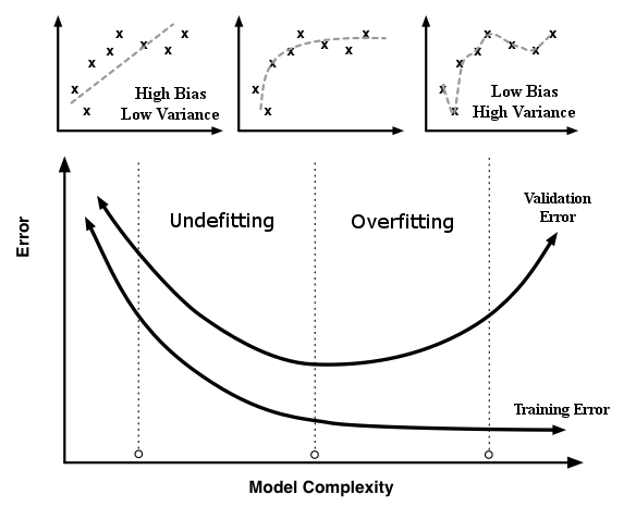
Error vs Model Complexity Chart

Now we need to define which parameter will represent the X axis of the chart. But first we need to define the 3 machine learning algorithms that we’ll gonna use in the demo (part 4 and 5) of this post series:

  • GLM with Elastic Net Regularization, which has two hyperparameters: lambda and alpha. The selected parameter to represent the X axis is log10lambda. Some disadvantages of this algorithm is: it needs an trial and error search for the high order interaction terms, it requires one hot encoding for categorical variables and also standardization of numerical ones;
  • GBM, which was first proposed to estimate PS function by (McCaffrey et al. 2004), has four hyperparameters: number of trees, max depth, learning rate and learning rate annealing. The selected parameter to represent the X axis is number of trees. Some advantages of this algorithm: it deals naturally with high order interaction terms, with categorical variables and it doesn’t need standardization of numerical variables.
  • And of course, the GLM without Regularization, which is the default approach of vast majority of statisticians. Once, it doesn’t need a hyperparameters search, it is very simple to use and all this discussion about error measurement so far doesn’t apply to it. After estimating the model usually the analyst compares the mean of each covariate between both groups to have an idea how small is the final distribution discrepancy. If it still not small enough, she performs a trial and error search for covariates high order interaction terms trying to minimize the difference between the means. As it is well known and the most used algorithm, we’ll use it as our benchmark, so the heterogeneity metric calculated for it will just have the comparison purpose between its behaviour and the other algorithms’ one.

An reminder, all selected machine learning algorithms must support weight for each observation, as for each iteration new weights will be calculated and used in the next iteration to estimate a new statistical model.

So after defining the error metric and the function which needs to be minimized, the next step is to define how to execute the minimization search itself. As one of the requirements is minimization without using derivatives, we chose the R’s optimize method that is a combination of golden section search and successive parabolic interpolation to find the local minimum value of a function or the global minimum if such function is unimodal.

As the optimize method could call the function to be optimized with the same value more than once, it is a good idea to implement such function using a closure, to enable us to cache during a search all calculated values of heterogeneity metric associated to the hyperparameters used as key.

The Machine Learning Engine: H2O.ai

As the causal inference adjustment requires a hyperparameter search not once, but for each iteration of the inverse probability weight process until it converges, we need to select a ML engine very fast and efficient in resource consumption. Giving preference for the ones that would allow the execution of this procedure in multi-core laptops or clusters without changing too much the code implemented.

We think that H2O.ai is such engine. As its description in its websites says:

“H2O is the world’s leading open source machine learning platform. H2O is used by over 60,000 data scientists and more than 7,000 organizations around the world. H2O is an open source, in-memory, distributed, fast, and scalable machine learning and predictive analytics platform that allows you to build machine learning models on big data and provides easy productionalization of those models in an enterprise environment. H2O’s core code is written in Java. Inside H2O, a Distributed Key/Value store is used to access and reference data, models, objects, etc., across all nodes and machines. The algorithms are implemented on top of H2O’s distributed Map/Reduce framework and utilize the Java Fork/Join framework for multi-threading. The data is read in parallel and is distributed across the cluster and stored in memory in a columnar format in a compressed way. H2O’s data parser has built-in intelligence to guess the schema of the incoming dataset and supports data ingest from multiple sources in various formats. H2O’s REST API allows access to all the capabilities of H2O from an external program or script via JSON over HTTP. The Rest API is used by H2O’s web interface (Flow UI), R binding (H2O-R), and Python binding (H2O-Python). The speed, quality, ease-of-use, and model-deployment for the various cutting edge Supervised and Unsupervised algorithms like Deep Learning, Tree Ensembles, and GLRM make H2O a highly sought after API for big data data science.”


Wrapping up

Now we have all elements to implement our causal inference algorithm in R. In the next post we’ll show some demos with source code to test how our approach performs in different setups and with different machine learning algorithms.

Previous Post – Causal Inference Theory With Observational Data = Structural Causal Model + Propensity Score + Iterative Inverse Probability Weighting

Any feedback send to frederico.nogueira@gmail.com

Causal Inference Theory With Observational Data = Structural Causal Model + Propensity Score + Iterative Inverse Probability Weighting

In the previous post we described the photographer analogy to explain in a informal way how causal inference works. Now we’ll dive in the theory behind it to understand, in the point of view of structural causal model, what necessary adjustments observational data requires and how they can be performed. But, first we need to defined what is a SCM.


Structural Causal Model and DAGs

A structural causal model consists of set of variables, and a set of functions that assigns each variable a value based on the values of the other variables in the model. Such functions represent the causation between variables: A variable X is a direct cause of a variable Y if X appears in the function that assigns Y’s value. X is a indirect cause of Y, if it is appears in any function, indepedent of the depth, of the variables that are inputs of f which defines the value of Y.

X is a direct cause of Y: Y = f(X, Other Variables)

X is an indirect cause of Y: Y = f(Z, Other Variables) and Z = g(X, Other Variables)

Every SCM is associated with a graphical causal model that is represented as a DAG (directed acyclic graph). “DAGs consist of three elements: variables (nodes, vertices), arrows (edges), and missing arrows. Arrows represent possible direct causal effects between pairs of variables and order the variables in time. The arrow between C and Y means that C may exert a direct causal effect on Y for at least one member of the population. Missing arrows represent the strong assumption of no direct causal effect between two variables for every member of the population (a so-called “strong null” hypothesis of no effect). The missing arrow between T and Y asserts the complete absence of a direct causal effect of T on Y. DAGs are nonparametric constructs: They make no statement about the distribution of the variables (e.g., normal, Poisson), the functional form of the direct effects (e.g., linear, nonlinear, stepwise), or the magnitude of the causal effects.” Handbook of Causal Analysis for Social Research, pag. 248.

To make clearer, we can imagine the SCM as the mechanism by which a dataset is generated. So, if we have the full specification of the SCM, all functions and independent variables, we can recreate the associated dataset. In the demonstration post (part 4), we will use a full specified SCM to simulate causal inference studies for the purpose to show how the algorithms perform.

Bringing this definition to the intervention setting, where we want to discover the effect of a treatment, we could draw a generic DAG to help us to visualize and understand what happens in a intervention study. The next figure shows a very simple DAG, where the T variable is the treatment, the O is the outcome yielded after the treatment has been applied and the covariates from V1 to VN represent the influences on the treatment assignment process. From now on, we’ll gonna call all variables different from T and O in a intervention SCM by covariates.

image07

If we remember our previous post, one of the main characteristics of a random experiment is the random assignment of the treatment, i.e. it is influenced by no covariate. Therefore, if we redraw the previous DAG now representing a generic random experiment, we would obtain the figure below, where there is no edge entering T, i.e. T is independent of the covariates V1, …, VN.

image05

Summing up, these simple DAG’s give us a clear purpose. We need to find a process that performs a blockage of V1, …, VN’s influence over the treatment variable in the observational dataset, which is formally defined ahead by the backdoor criterion. However, to perform causal inference of the treatment effect, we need to keep intact O=fo(T,PAo) after the adjustments, i.e. the causal relation T -> O and PAo -> O, where PAo represents all covariates that have edges entering in O, i.e. the covariates parents of O. But first, we need to understand the basic configurations of covariates connections in a SCM.


Three Possible Causal Configurations of Covariates and Their Blockage Behavior on Conditioning

=> Chains. Rule 1 (Conditional Independence in Chains). Two covariates, A and C, are conditionally independent given B, if there is only one unidirectional path between A and B and C in any set of covariates that intercepts that path. So if you condition on (filter) B, you block the causal link connection B-C.

 image01           image03

To understand why this happens, we need to remember that when we condition on B, we filter the data into groups based on the value of B, i.e. we create many datasets, each with the same value of B, that together recreates the original one. Now, we select only the dataset where B=b to take a closer look. We want to know whether, in these cases only, the value of C is independent of the value of A. We know that, without the conditioning over B, if the value of A changes the value of B is likely to change. And if the value of B changes, the value of C is likely to change as well. But as we are looking only in the dataset where all values of B is equal b, all values of A in this dataset entails B=b. Therefore, C remains unaltered for any change of A in this dataset. Remember that the same thing applies to all datasets with the same value for B. Thus, C is independent of A, conditional on B.

=> Forks. Rule 2 (Conditional Independence in Forks). If a covariate B is a common cause of covariates A and C, and there is only one path between A and C, then A and C are independent conditional on B. So if you filter B for a specific value, you block the causal link connection B-A and  B-C. We can also use the previous rationale to justify this case.

image11                   image08

=> Colliders. Rule 3 (Conditional Independence in Colliders) If a covariate B is the collision node between two covariates A and C, and there is only one path between A and C, then A and C are unconditionally independent but are dependent conditional on B and any descendants of B. So if you filter B for a specific value, you block the causal link connection A-B and C-B. However, you create a spurious causal link connecting A and C.

image09                   image02

Judea Pearl explains very clearly, in his book – page 41, this apparent strange behavior:

“Why would two independent covariates suddenly become dependent when we condition on their common effect? To answer this question, we return again to the definition of conditioning as filtering by the value of the conditioning covariate. When we condition on B, we limit our comparisons to cases in which B takes the same value. But remember that B depends, for its value, on A and C. So, when comparing cases where B takes, for example, the value b, any change in value of A must be compensated for by a change in the value of C — otherwise, the value of B would change as well.”

These three possible configurations will be the base for the definition of the backdoor criterion in the next section, which states how the adjustment in observational data can be done to simulate a random experimental dataset. If you’d like more details on these configurations, check this post and/or this book out.


General DAG of Intervention Study on Observational Data

image10

When you think about possible kinds of the covariates inside a SCM of a intervention study, we can separate them in 2 groups that are overlapped:

  1. Based on the time flow:
    • Pre-treatment. These are covariates that are not affected by the treatment and their values are defined previous to the execution of the intervention;
    • Post-treatment. These are covariates that are affected by the treatment and their values are defined after the intervention is executed.
  2. Based on measurement:
    • Measured and Recorded. These are the covariates that were correctly measured during the study and they will be the base for our adjustments.
    • Unmeasured. These covariates are the ones left out of the measurement process and their impact in the causal inference process must be assessed. When a important covariate is ignored, the conclusion drawn after the adjustment is possibly distorted.

The sets contained inside each combination of these two groups must be dealt with in specific ways to properly enable the measurement of the treatment’s impact:

  • Measured and Recorded / Pre-Treatment: All covariates contained by sets 1,2 must satisfy the backdoor criterion relative to variables T and O, i.e. we need to block their influence on the treatment variable. As these sets are composed by covariates that fits the configuration represented by chains and forks, it is possible to use conditioning on them, creating a blockage without spurious paths appearing on the covariate previously connect to the treatment variable;
  • Unmeasured / Pre-Treatment: Sets 4,5 must be empty, once they contain only unmeasured covariates. Otherwise, they won’t satisfy the backdoor criterion. Thus, we need to use theory or empirical knowledge of the domain in question to state a justification that both sets are empty;
  • Measured and Recorded / Post-treatment: All covariates contained by set 3 must be ignored during the adjustment process. So, we must identify all covariates in set 3 also using theory or empirical knowledge and remove them from the covariates that will participate in the blocking process. If they wrongly participate, we would create spurious paths on the treatment variable as shown in the diagrams explaining the collider connection. Thus, possibly introducing more bias into the dataset;
  • Unmeasured / Post-treatment: Finally, set 6 is automatically ignored, once none of its covariates were measured.

Those steps are based on the backdoor criterion, which is stated below:

(The Backdoor Criterion) Given an ordered pair of variables (T, O) in a directed acyclic graph G, a set of covariates satisfies the backdoor criterion relative to (T, O) if no covariate in this set is a descendant of T (i.e. these covariates cannot be contained by sets 3,6), and they BLOCK every path between T and O that contains an arrow into T. In other words, these covariates must be contained by sets 1,2 only. If you’d like more details on that, check this book – page 61.

But how we can block the influence of these covariates? In the previous section, we learnt that is possible to block variables if we use condition probability (filter). This would allows us to use Bayesian statistics to find the equation representing the effects of the treatment after adjusting for sets 1 and 2. However, it is a big problem to use this approach in real data. Judea Pearl in his book – page 72, describes it very precisely:

‘It entails looking at each value or combination of values of [the covariates in sets 1 and 2] separately, estimating the conditional probability of [O] given [T] in that stratum and then averaging the results. As the number of strata increases, adjusting for [sets 1 and 2] will encounter both computational and estimational difficulties.

Since the [sets 1 and 2] can be comprised of dozens of variables, each spanning dozens of discrete values, the summation required by the adjustment formula may be formidable, and the number of data samples falling within each [possible value combination of the covariates in sets 1 and 2’s] cell may be too small to provide reliable estimates of the conditional probabilities involved.’ – The text inside brackets was adapted for clarity.

Now what? Give up? Is there another possible way to apply the backdoor criterion by blocking covariates without applying conditional probability for each one of them?


Propensity Score to The Rescue

The propensity score is the conditional probability of assignment to a treatment group given the covariates. It can be described as a balancing score. This means that, conditional on the propensity score, treatment variable is independent of measured baseline covariates. Therefore, the distribution of all covariates is the same in the treatment group as in the control group.

Now in English: To simplify the explanation, we’ll limit the propensity score in this post series to exactly two levels, as defined by Rosenbaum and Rubin (1983), that roughly translates in the probability of a subject being treated given her background characteristics. So, in an ideal randomized trial, the propensity score is p(T=1)=0.5 for all individuals, independent of the final group (treatment or control) that they were assigned to.

In contrast, in observational studies some individuals may be more likely to receive treatment than others, which creates biases. So, the adjustment that must be applied to this dataset will force the probability of treatment assignment to be set to 0.5, when conditioned on PS: p(T=1|ps(PAt))=0.5, where PAt are all covariates parent of T. But, first we need to know the true propensity score function of the dataset. Unfortunately it is a unknown function, once the treatment assignment is beyond the control of the investigators. Therefore, the only alternative is to estimate it directly from the data using statistical models. Which in turn, creates a new condition that must be satisfied: no model misspecification. In case of misspecification, even if we achieve the final result p(T=1|ps(PAt))=0.5 for all observations, yet the paths between T and covariates in the sets 1 and 2 wouldn’t be completely blocked. It is important to keep in mind, when all paths between T and covariates in the sets 1 and 2 are blocked, it entails that p(T=1|ps(PAt))=0.5, but not the other way around.

Now the problem resumes in studying which techniques are the best to properly estimate the PS function from data. But, for didactical purpose, we’ll skip this step for now and dive in the process of using these estimated treatment assignment probabilities to perform the needed adjustments.


We Have The PS Estimation, Now What?

Estimating the propensity score function using statistical model is only the first task. Now, we need to choose the appropriate approach to balance the distribution of the covariates in sets 1,2 between treatment and the control group. The most commons are:

Matching. As the name imply, it matches observations from the treatment with the control group with the closest given a predefined distance function based on the estimated propensity score. Often the group with fewer subjects is the base and the other group is used to find the matches. The base group defines the subpopulation on which the causal effect is being computed, which usually implies in observations being discarded in the other group. Moreover, matching doesn’t need to be one-to-one (matching pairs), as portrait in the figure below, but it can be one-to-many (matching sets). Because the matched population is a subset of the original study population, the distribution of causal effect modifiers in the matched study population will generally differ from that in the original, unmatched study population;

An imaginary propensity score horizontal axis from left to right

image06

Stratification / restriction. It matches all treatment observations to the control ones inside a stratified propensity score by quantiles or by uniform intervals, in the figure below the stratas are represented by the colors. Given the proportion between control and control observation in each strata, weights are calculated and attributed to the observations in that strata;

Many times one of the groups stands alone in the strata, as represented by the orange one below, and a merge must be performed

image04

Inverse Probability Weighting. It is a way to correct for the over-representation of certain types of individuals, where the “type” is captured by the probability of being included in the treatment. It uses weights based on the propensity score to create a artificial population in which the distribution of measured covariates is independent of treatment assignment. The use of IPW is similar to the use of survey sampling weights that are used to weight survey samples so that they are representative of specific populations (Morgan & Todd, 2008). The figure below represents the new weights, in colors intensity, based on the propensity score, an imaginary horizontal axis from left to right. We can notice that it creates a symmetry between weights on the treatment and the control group, which reduces the unbalancing. The way the weights are calculated in the IPW technique allows the execution of multiple iterations, where the next always improves on the last one. This characteristic enables a certain tolerance of misspecified treatment assignment probability models, once the next iteration can always try to compensate what the last one misspecified. Which creates a robustness non existent in the previous described techniques. Therefore, IIPW is even able to adjust for a non-linear treatment assignment probability mechanism using a linear treatment assignment probability model (van der Wal, W.M 2011).

Wt=1/ps and Wc=1/(1-ps)

image00

Before we choose our method, we need to explicitly define the causal question to be answered. Otherwise, misunderstandings might easily arise when effect measures obtained via different methods appears to be different. As we want to estimate the mean of the causal function of O for values T=0 and T=1, we don’t need to hold the proportion of the treatment or the control population static. Therefore we can accept the creation of artificial populations based on the initial one. Thus, for this post, we chose IP Weighting (book – Chapter 12), because it is perfect to calculate the causal effect to the entire population and it has an interesting property that allows us to iterate the balancing process.


ATE vs ITE

So far the procedure described has the purpose to estimate ATE = Ê[O|T=1]- Ê[O|T=0] for the population represented by the observational dataset, ATE stands for average treatment estimate, and to check the probability of the null hypothesis violation using a t-test. In resume, it uses a iterative PS function, T=ft(PAt), estimation to reweight the observations, thus creating a final adjusted observational dataset. However, is it possible to use this estimation to calculate the ATE for a different population, i.e. different observational dataset?

Yes! To do that we need to estimate, from the adjusted data, the function O=fo(T,PAo), which defines the causal effect of the variable T in the variable O. Using such function, we can estimate the ITE, individual treatment estimation, for each observation in the new dataset and then its ATE, given that we have PAo, the covariates parents of O.

However, a few conditions must be satisfied by the adjusted dataset to allow a correct estimation of O=fo(T,PAo):

  • A statistical algorithm that yields KS {fo(T=0,PAo), Ê[O|T=0]} and KS {fo(T=1,PAo), Ê[O|T=1]} very small, where KS is Kolmogorov-Smirnov the test of homogeneity, after the adjustment;
  • And finally, the observational data used to estimate the propensity score must have a minimum number of observations to properly estimate the distribution of the covariates.

The estimation of fo(T,PAo) is a regular machine learning prediction procedure, where we need to split the adjusted observational data in training, validation and test dataset and use a machine learning algorithm complex enough to properly fit the data.

Wrapping up

In this post we described how causal reality can be modeled using SCM and how we can use backdoor criterion with propensity score function estimation to remove confounding and selection biases, thus guaranteeing the exchangeability condition. We decided that the best approach to use the estimated treatment assignment probabilities is using IIPW to maximize the chance to avoid the misspecification model problem.

In the next post we’ll return to the point we skipped about the techniques necessaries to estimate PS and describe other practical aspects to implement the desired algorithm for causal inference the best way possible.

Next Post – Causal Inference in Practice With Observational Data = Machine Learning + Heterogeneity Metric (KS + X2 Tests) + Optimize Function + Metric Cache + H2O.ai

Previous Post – Causal Inference Study Motivation: The Photographer Analogy

Any feedback send to frederico.nogueira@gmail.com

Causal Inference Study Motivation: The Photographer Analogy

In these post series, we’ll approach the subject from a practical point of view, using R scripts and H2O.ai models to show how to simulate random assigned experiments using observational data. It is divided in 5 parts:

  1. Explaining causal inference using The Photographer Analogy;
  2. Causal inference theory from the point of view of SCM;
  3. Causal inference in practice using machine learning;
  4. Linear / parametric causal inference study simulation with observational data;
  5. Nonlinear / nonparametric causal inference study simulation with observational data.

Explaining Causal Inference Using The Photographer Analogy

We all know that an photographer can only capture the reality around her through her camera. She uses her knowledge on how to adjust the focus of her lens to portrait the desired scene in a reliable way. Otherwise, the only thing she would get is a blur that barely reminds the true reality.

Having such dynamic in mind, we can use it as an analogy to explain how causal inference works. The scene that the photographer desires to take a picture can be considered the unknown causal reality of two variables (T -> O), where T is treatment and O is the outcome yielded, when we set T for a specific value. However, this picture is not easily obtained. If we try to take this picture without the proper adjustments, it will only register a “causal blur”.

In this settings, we can compare the camera to the probability calculus and statistics that allow us to measure associations and correlations. However, as everybody already know: “correlation is not necessarily equals causation”. Therefore, the only way to properly measure the causality is to apply some adjustments in the specific context to guarantee that the measured association is equal the desired causation. Such adjustments can be done using the lens of our statistical camera to focus it properly in the selected causal relation. In this analogy, the lens represents the data, used in the analysis, which can be classified in two types: “fixed-focus” and “dynamic focus”.

The first type is represented by controlled or random assignment experiments which are executed, in the natural sciences and part of life and social sciences, by controlling the measurement process and the environment where the experiment takes place. Those requirements are easier to achieve in the natural sciences (physics and chemistry), once inside a laboratory all variables can be controlled and set to the desirable value. For life and social sciences, usually, they cannot be controlled in this way, so they are randomised to avoid any selection and confounding biases when controlling the the treatment assignment. Which in turn creates ethical and budget problems, given that they deal with human and other living beings.

In the photographer analogy, the process to measure the reality can be defined in such way to already generate a “focused” data (our lens) for the desired causality. Thus, the association of specific variables registered by the probability calculus (our camera) already represents true causation. In other words, we can create a very expensive and difficult to manufacture fixed-focus lens which the only purpose is to show an specific causal reality, i.e., when Ê[fo(T=0, PAo)] and Ê[fo(T=1, PAo)] is equal to Ê[O|T=0] and Ê[O|T=1], where O is the outcome variable, T is the treatment variable and PAo are the covariates parents of O.

image02

Association is equal causation when the lens (data) is properly focused

The second one is equivalent to observational data obtained from bureaucratic records or population studies. As such data has, originally, a different purpose, it is relatively cheap to be used for causal inference. However, this kind of data, as you can imagine, requires a complex adjustment process to reveal the desired causal relations. So, it is equivalent to a dynamic focus lens that can be adjusted to focus on a specific scene by the photographer. These quasi-experimental and observational data, which are the the big part of life and social sciences, need to satisfy 4 obligatory conditions, book chapter 13 section 5, to resemble a randomized experiment:

  • No measurement error:
    • No random error which leads to imprecise results. However, these sort of error will cancel each other out in the long run (large sample size). Random error may occur as a result of measurement error or from the variability inherent in sampling;
    • No systemic error which is the effect of off-target measurement by the observer, the instrument, or the subject;
  • Consistency. It guarantees well-defined interventions. The presence of multiple versions of the same treatment is problematic when these versions impacts differently the outcome. At the very least, investigators need to characterize the versions of treatment that operate in the population, so the different impacts can be properly identified and, if the case, ignored;
  • Positivity. All observation must have a probability between 0 and 1 to be assigned to the treatment group, not including 0 neither 1. There are two possible ways in which positivity can be violated:
    • Structural violations: Individuals with certain values of covariates or extremes propensity scores values, as zero or one, that cannot possibly be treated or untreated. In the presence of structural violations, causal inferences cannot be made about the entire population. The inference needs to be restricted to strata in which structural positivity holds;
    • Random violations: As real samples are finite, if we stratify on several covariates, we will start finding empty cells at some places even if the probability of treatment is not really zero in the population. This is a random, not structural, violation of positivity because the zeroes appear randomly at different places in different samples of the population. In the presence of random violations, we can use a statistical model (propensity score model) to estimate the probability of treatment in the randomly empty stratas using data from individuals in the other stratas;
  • Exchangeability. The treated and the untreated must be exchangeable. Implying that if the treated had they remained untreated it would have experienced the same average outcome as the untreated did, and vice versa. The lack of exchangeability is the result of:
    • Confounding bias which is caused by covariates satisfying two conditions: be associated with the treatment without being affected by it and be associated with the outcome variable independently of the treatment (not an intermediary). And it is the cause of the Simpson’s paradox, in which a trend appears in different groups of data, but disappears or reverses when these groups are combined;

image00

Confounder

    • Selection bias  is an association between treatment and outcome variable created as a result of the process by which individuals are selected into or whether they remained until the end of the study. It can arise in both randomized experiments and observational studies. Examples, self-selection bias, volunteer bias, survival bias, differential loss to follow-up, missing data bias, nonresponse bias and selection affected by treatment received before study entry etc;
    • The process to remove both biases in high-dimensional data creates the need to use statistical models and, thus, “no model misspecification” becomes a new condition to be satisfied.

Returning to the photographer analogy, the focusing of the lens (data) is performed to satisfy the exchangeability condition on observational datasets. So, if the measurement process was not designed with the purpose of causation in mind, the possible alternative is to adjust the “out of focus” data (our lens) by “focusing” on specific variables in the structural causal model, and allow the probability calculus (our camera) register their true causation via association. In other words, we find a lens created with a different purpose in mind or with the focus defined incorrectly, but that still satisfies the 3 first conditions, except for exchangeability, and adjust it to show the desired causal reality.

image03

The lens (data) must be properly focused before association becomes equivalent to causation

image01

Summarizing the artifacts of the analogy:

  • Data scientist is equivalent to the photographer. She can only view and analyze the causal reality through her camera;
  • Probability calculus and statistics is equivalent to her camera. It is a tool that can only “see” (register) associations / correlations;
  • Data is equivalent to our camera lens. It can be adjusted (focused) to make association equals causation on specific variables through 4 mandatory conditions: no measurement error, consistency, positivity and exchangeability;
  • Measurement process is equivalent to the manufacturing process of our lens (data). It can be defined to generate data that make association equals causation for specific variables (controlled or random experiments). But it can also be defined with a different purpose in mind, but causal, like administrative records of bureaucratic processes or studies of a population taking a census or selecting a sample;
  • Structural causal model is an approximation of the causal reality which we want to study. It will be succinctly defined in the next post. More precisely the photographer can only “see” a little piece of the SCM of the phenomenon studied. Her purpose is to estimate the value of the function: O=fo(T, PAo) for the values T=0 and T=1, where O is the outcome variable, T is the treatment variable and PAo are the covariates parents of O. As we don’t know the real function fo, we can only estimate  Ê[fo(T=0, PAo)] and Ê[fo(T=1, PAo)], which represent interventions in T. But, remember, the camera can only register Ê[O|T=0] and Ê[O|T=1], i.e., associations. Therefore, the photographer need to use an already focused lens or a lens that can be adjusted to make causation equals association for the studied variables T and O.

So, what can observational data without these adjustments be used for? Usually, any statistics calculated using quasi-experimental or observational data without any adjustment are limited to descriptive statistics, only. But what does it mean? It means that no causal conclusion can be drawn by applying hypothesis tests directly on the original data or by just looking at means and medians of indicators. If did so, it will only measure a “causal blur”, nothing else. That is a crucial point which most people have no clue about it, including journalists. Many news headlines tries to catch eyes and clicks only based in spurious conclusions and many people believe it just because it is in the news. Roughly, this situation translates into lack of intellectual honesty or cause-effect illiteracy. And, unfortunately, it is a situation that will not change anytime soon.

In the next post (part 2) we’ll explain the definition of structural causal model that we used in the analogy, which is probably unknown for most readers, and is the base of our reasoning for the implementation of a causal inference “autofocus” algorithm that is the purpose of this post series.

Next Post – Causal Inference Theory With Observational Data = Structural Causal Model + Propensity Score + Iterative Inverse Probability Weighting

Any feedback send to frederico.nogueira@gmail.com